Max-Width
Max-width property allows you to set the max width of the element. The purpose of max-width is to prevent the element from extending the boundary.
Max-Width Container
In the example below, we specify the container to display at 800px if possible, but it should not exceed 90% of the boundary width.
.container {

width: 800px;

max-width: 90%;

}
Responsive Image
You can make the image auto resize to the max width of the boundary by using max-width:100% and height:auto.
img {

max-width: 100%;

height: auto;

}
The above responsive image CSS works on IE7 and IE9, but doesn’t work on IE8. To fix it, add width:auto. You may apply a conditional CSS specifically for IE8 or use the IE hack below:
@media screen {

img {

width: auto; /* for ie 8 */

}

}
Min-Width
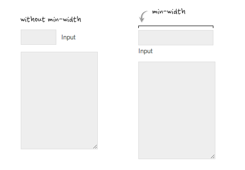
Min-width is opposite to max-width. It sets the minimum width of an element. In the example form below, min-width is used on the input text field to prevent the input from getting very small when scaling down.
